About me
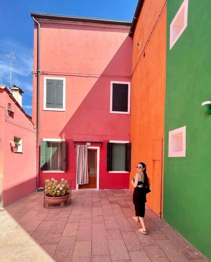
As a self proclaimed ‘late blooming artist’ my art journey began as a senior in high school and later took flight as I earned my B.S. degree in Computer Art from The New York State University at Oneonta.
After dabbling in fine arts, web design, art history and much more, I found my passion through graphic design. My love of reading and art translated over to the world of design allowing me to tell stories and facts made visual.
Since then, I've had the pleasure of designing for Relix Magazine, freelancing for the NYC Department of Education, Metro Realtors Federal Credit Union & several holistic companies.
Over the last two years I've worked full time as the Junior Graphic Designer at Colette Baron-Reid with full responsibility as the head of social media designs and associate brander.
My Work - Colette Baron-Reid

Oracle School
01
Background
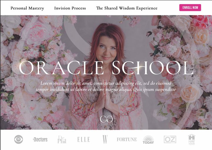
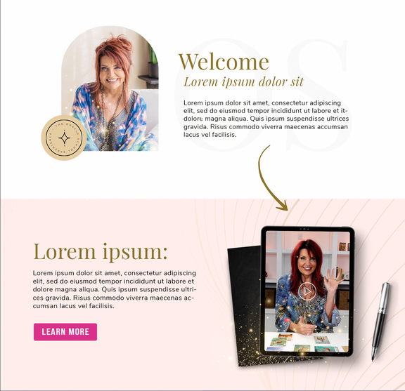
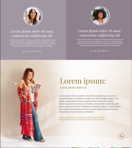
Colette Baron-Reid offers an extensive Oracle School program that offers the in's and out's of all things Oracle Cards. The client wanted a modern, clean cut rebrand that still kept the magical essence of their brand.
02
Solution
Aiming for a more editorial approach allowed for a classy, high-end feel. Pops of color on a more dominantly neutral background created the clean-cut, but magical angle the client requested.

Oracle School Branding


The Magic of Manifesting Workshop
01
Background
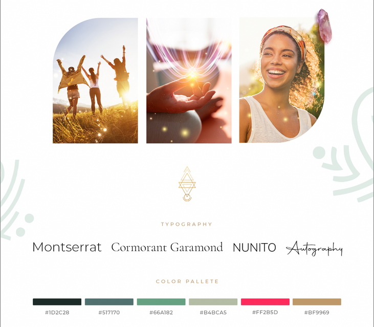
The Magic of Manifesting Workshop was a one night webinar launch where my client taught viewers the secrets of achieving their dreams and goals. The goal for this branding was metaphysical energy, serenity and abundance for the target audience.
02
Solution
The branding for this launch was kept minimal and peaceful. By keeping the branding to simple colors such as whites, blues & greens, this allowed for the calm essence and serenity needed to convey the message while still keeping the magical metaphysical feel of the entire Colette Baron-Reid brand.


The Magic of Manifesting Branding




Making Strides Learning Center
01
Background
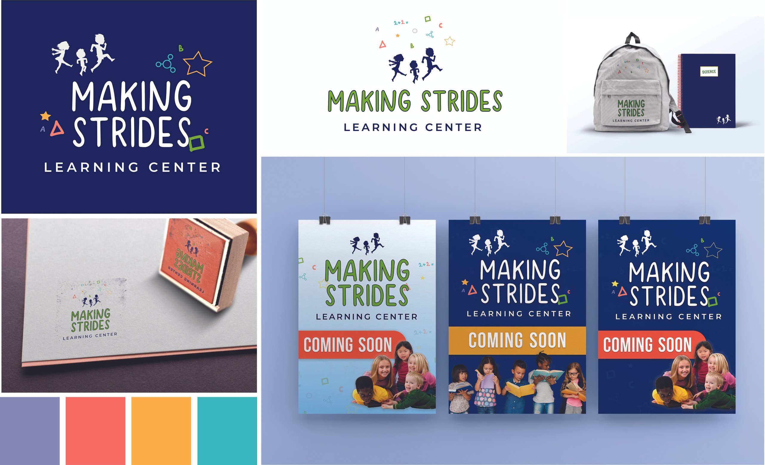
This client needed an entirely new brand identity for their learning center catered towards the ages of 3-11. The client requested bright colors and a brand that not only spoke to children, but to the parents as well.
02
Solution
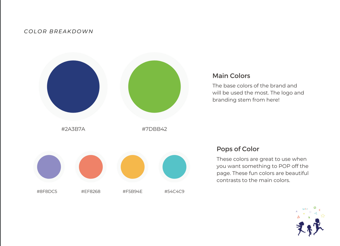
The clients name for their company aided in the creation of this logo - kids of multiple ages literally making strides to better their learning. The bright pops of colors through school shapes allowed for a fun insight on what parents and students can expect when enrolling.
Making Strides Branding Breakdown


Multimedia Personal Work
Digital Illustrations
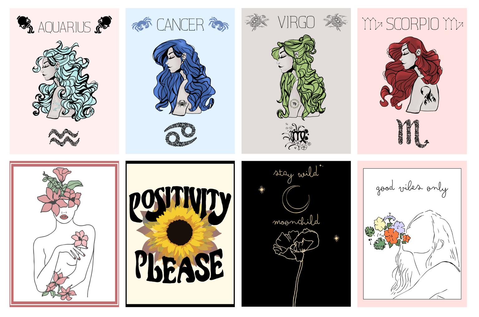
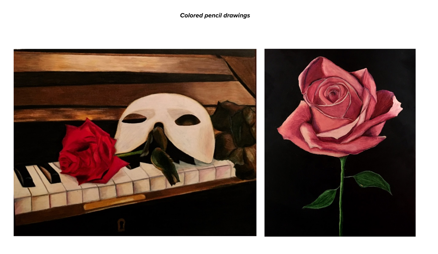
Colored Pencil Drawings
